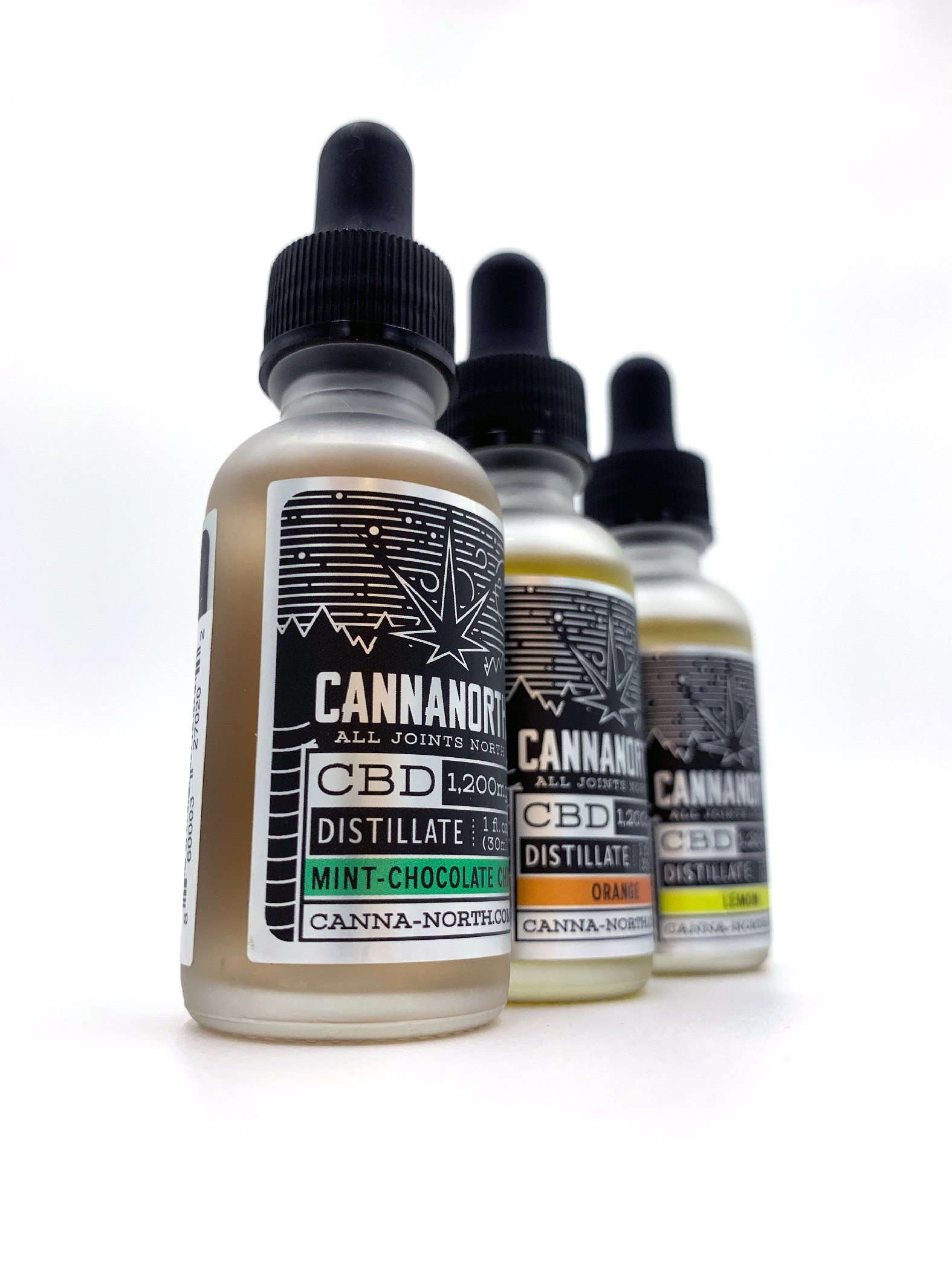
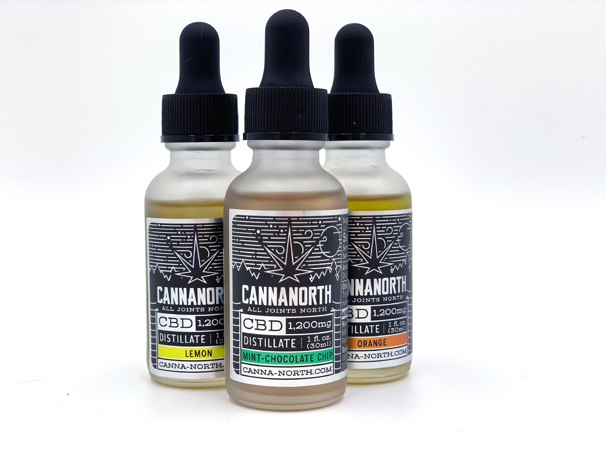
CannaNorth
A local hemp extraction facility was looking for a set of labels that would be useable across a variety of flavors and products without getting too complex. Utilizing a silver foil and two color printing made for a stark contrast when compared to the packaging of competitors.